

Elangoven Insurance Services
A sleek and responsive website for an emerging insurance firm, designed to deliver a digital experience that customers will love!
Duration - 4 design sprints
My role - Product designer
My responsibilities
User Research, UX Writing, Wireframing, Prototyping,
Usability testing
The problem
Local customers needed a simple and efficient way to inquire about insurance policies online, as the lack of a digital system made access to information and services a hassle.
The Goal
Create a user-friendly website for seamless insurance inquiries and access to informative content.
UX Research
A mixed-methods approach was used, including interviews with 10 participants, to understand user needs, pain points, and expectations for a quality online insurance experience.
Target Audience
Individuals in Tirupattur seeking insurance solutions, ranging from first-time buyers to those looking for better coverage in their insurance experience.
Pain Points

User Persona

User Journey

Competitive Analysis

A user-focused competitive analysis of two local insurance websites was conducted, assessing Ease of Navigation, Usability, Load Time, and Responsiveness. The insights gained helped identify key gaps, enabling the design of an intuitive and user-friendly experience.
Ideation
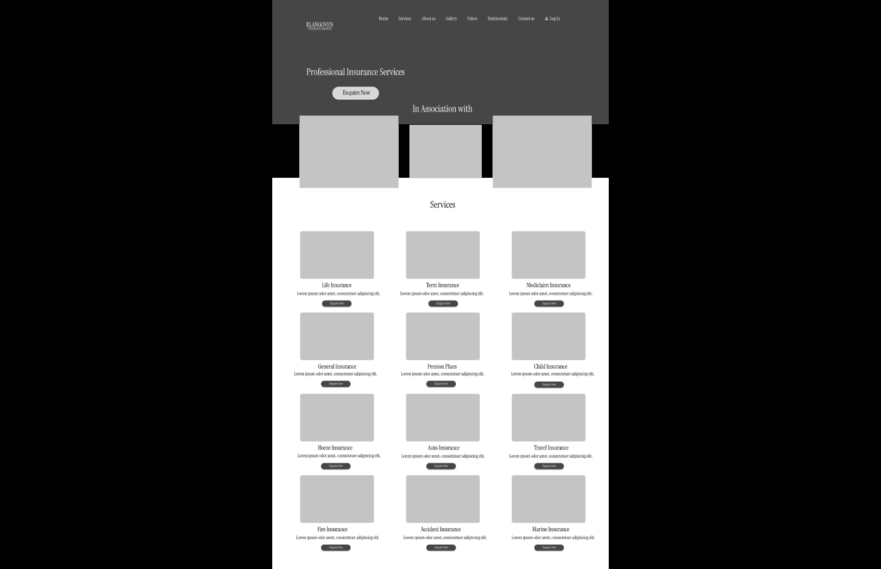
Features
1. Enquire about various insurance services available
2. Informative content on Insurance
3. Testimonials
Scribbles on a white board
start the day!


User Navigation
Paper Wireframes


Digital Wireframes
Desktop
Scrollable Home Part 1

Scrollable Home Part 2

Enquire Services


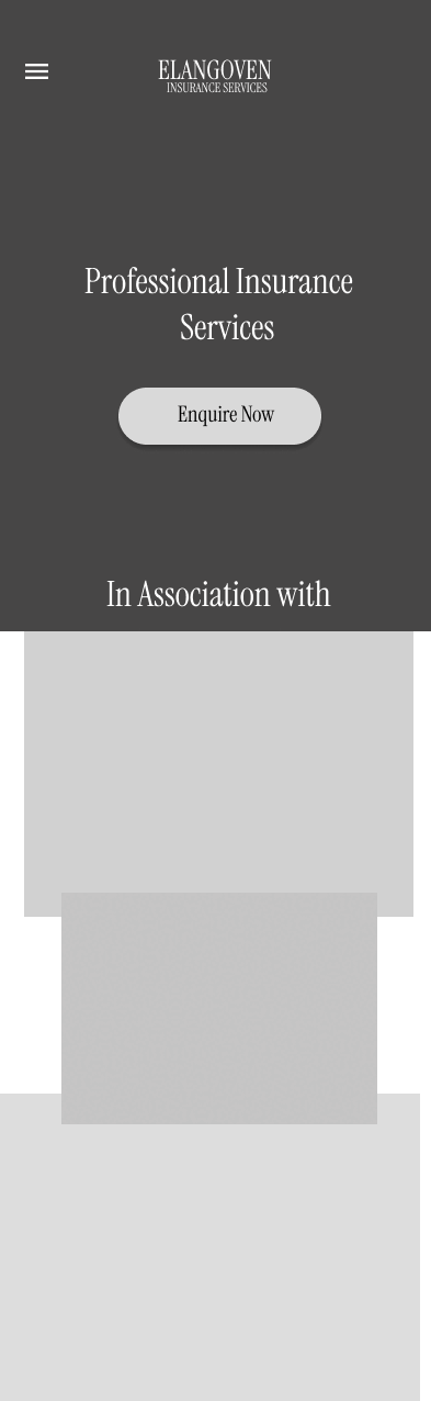
Mobile
Scrollable Home 1 & 2


Enquire Services


Lo-Fi Prototype
A low fidelity prototype of basic user navigation including home, services and send an inquiry.
Desktop
Mobile
Usability Study
Design Principles
Feedback - Users felt that the home scroll in Mobile lo-fi prototype is too long and would like a way to get back to the top without excessive scrolling
Change - A fixed 'Back to Top' button was added to the home scroll which instantly takes them back to the top with a single click
Responsive web design
Consistency
Visual hierarchy
Simplicity


before


after
Hi-Fidelity Prototype
Primary User Navigation
Mobile
Landing Page, Desktop

Desktop
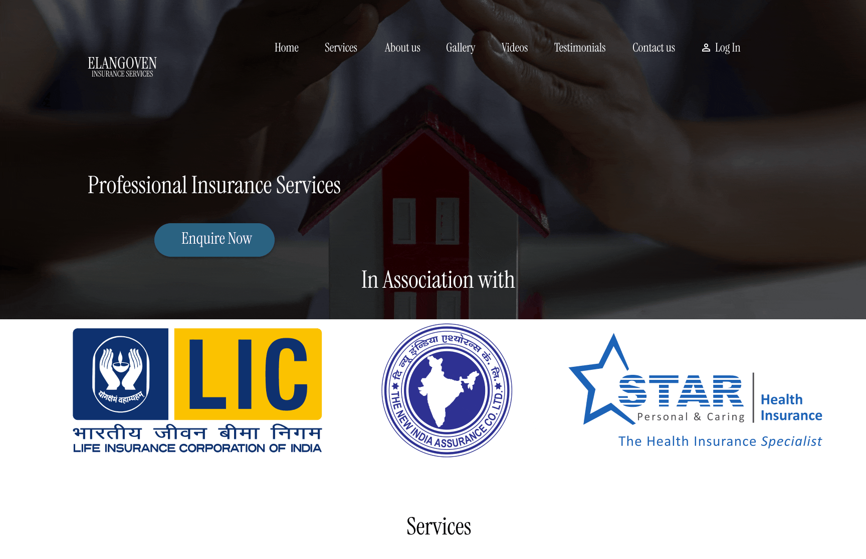
Enquire Services


Scrollable Home 1 & 2 across Desktop & Mobile


Landing Page, Mobile

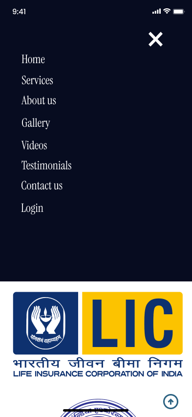
Menu

Enquire Services


Full Prototype
Desktop
Mobile
Information Architecure

Design System
Prototype Map
Yes, I can only admire the flow when it's all said and done!

Desktop

Mobile


Results
Accessibility Considerations
Project Takeaways
Balancing client vs user's needs is challenging. The insights from user research should ultimately influence the design.
I’ve learned that Iteration is key—refining designs based on user feedback and testing ensures a more intuitive and effective user experience.
-
High color contrast to enhance text readability, aligning with WCAG guidelines.
-
Captions for videos to improve accessibility for users with hearing impairments.
-
Keyboard navigation support for a seamless browsing experience without a mouse.
Going Forward
Incorporating diverse perspectives (as seen from the interviews of this case) will be crucial in creating more inclusive and user-centric designs, ensuring the website meets the needs of a broader audience. I’ll be in touch to monitor the design’s ux experience & the evolution of user needs.
“Every great design begins with an even better story.”
- Lorinda Mamo, Designer, Creative Director